fuseproject’s Brand team developed Plus Company’s new brand identity framework, strategy, messaging & positioning, and naming to represent the holding company as a new model for interagency teamwork. With new majority ownership through our Canadian partners, Plus Company is primed and positioned to showcase, amplify, and support the synergistic offerings of its agency groups, including fuseproject, cossette, We Are Social, and more.
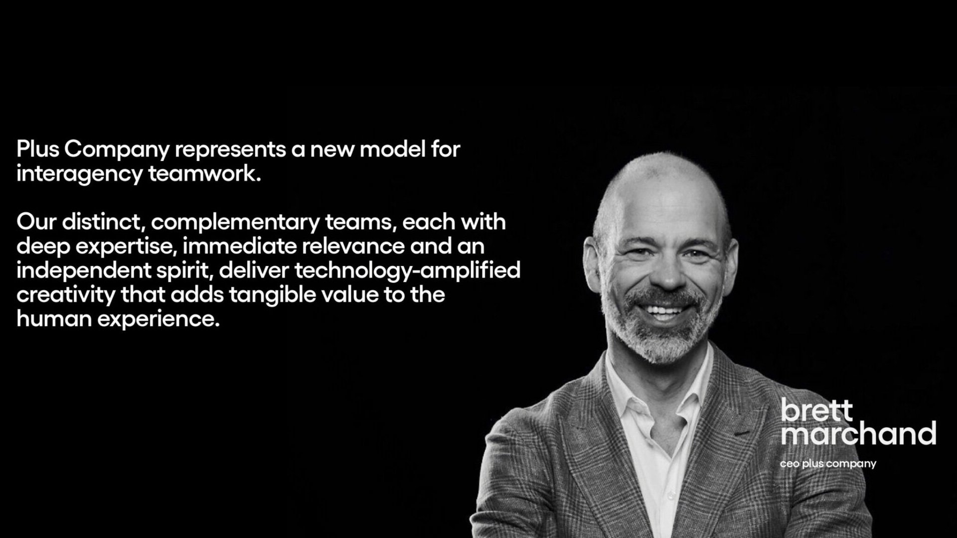
The rebrand required a bold and recognizable parent-brand balanced with differentiation and uniqueness available to each agency. Our alliance of organizations—all with deep expertise, immediate relevance, and an independent spirit to deliver technology-amplified creativity—adds tangible value to the adoption of meaningful ideas, human experience, and economic growth.
Before starting on the visual identity, fuseproject’s Strategy team developed a naming strategy, messaging, and positioning to set Plus Company apart as a global network.
To build a compelling and memorable brand that embodies the value we bring—to prospective employees, clients, and partner agencies—we decided on “Plus Company”, inherent in its name, to celebrate the dynamism, talent, and innovation of its creative, media, and PR agency partnerships. Plus Company, as implied by its name, is fueled by a group that believes in coming together to leverage and complement our respective offerings, creating unprecedented value for our global clients.
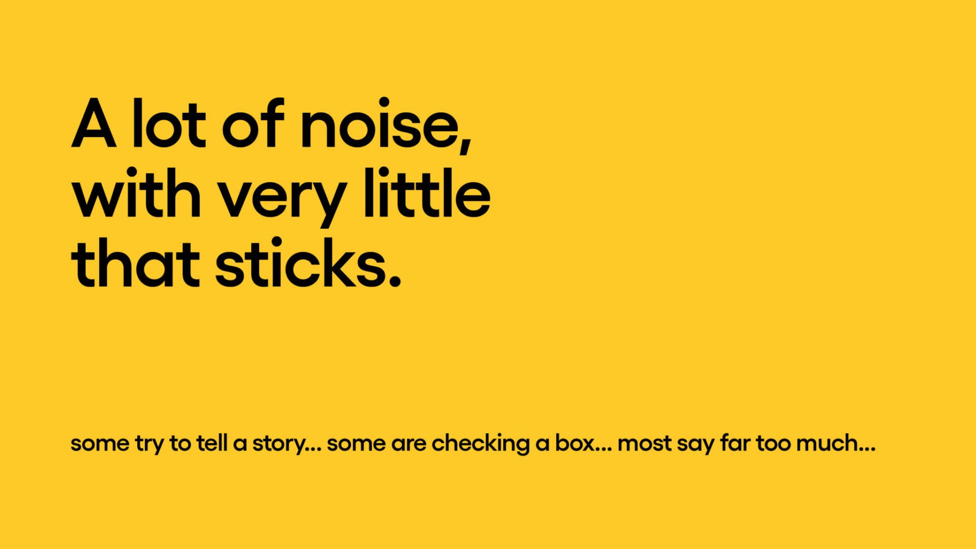
The brand positioning and core messaging emphasize the holding company’s position as a creative alliance that understands the power and economic value of creativity, partnership, and collaboration—highlighting core themes of multidisciplinary collaboration, new experiences, and industry firsts.
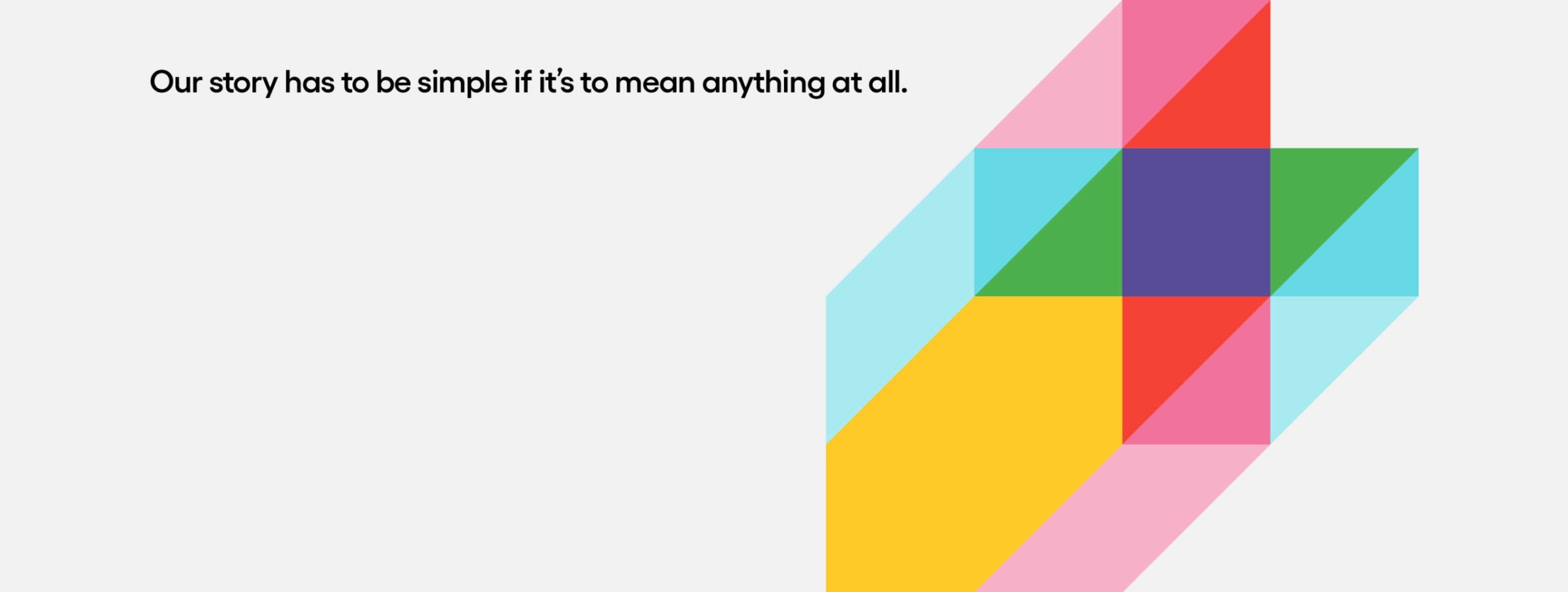
Working within the naming, messaging & positioning foundation set by our Strategy team, we developed a flexible brand architecture where both future and existing agencies can be incorporated easily into the storytelling. A key consideration was ensuring that the new design system allowed space for featured work from any agency to breathe within the Plus Company identity and ecosystem.
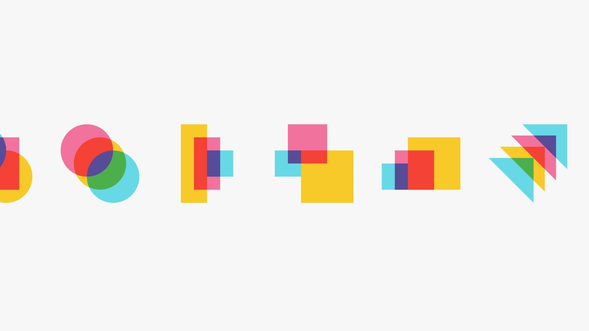
While deliberate and distinctive, the identity does not dictate look and feel when coupled with agency visuals. Black and white for the background palette means the colors and textures of visual content remain prominent throughout the brand’s expressions.
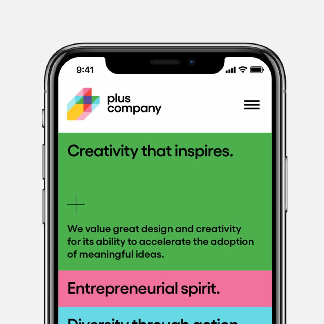
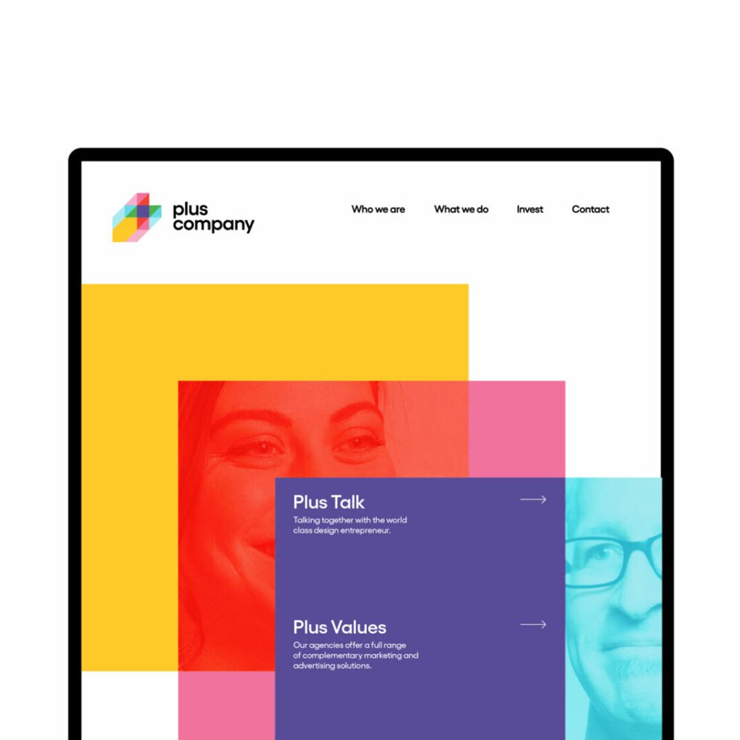
A system featuring eight primary colors is easily recognizable and extends to the website, where it organizes our mission, values, and other business facets. The color system captures what Plus Company is—a collaborative holding company that is distinct, effortless, and comes together as different teams to offer best-in-class design, marketing/advertising/PR, and tech services.
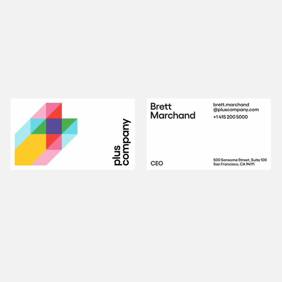
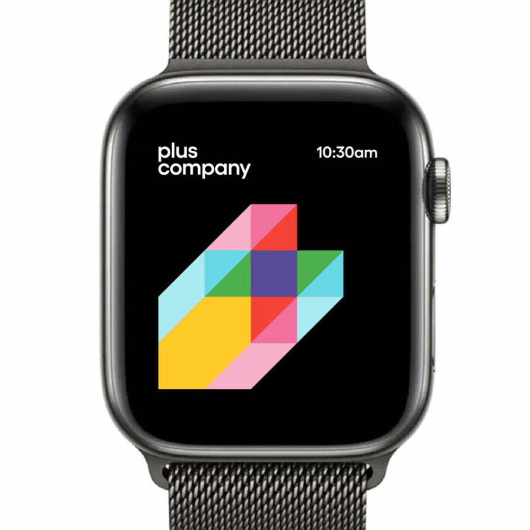
The new logotype is set in Gellix, a geometric sans serif with a clean, contemporary look that complements and reflects Plus Company’s family of innovative, category-changing agencies. Any configuration of a wordmark, lettermark, or icon can be added to it, giving the new identity flexibility to combine agencies or create new wordmarks.
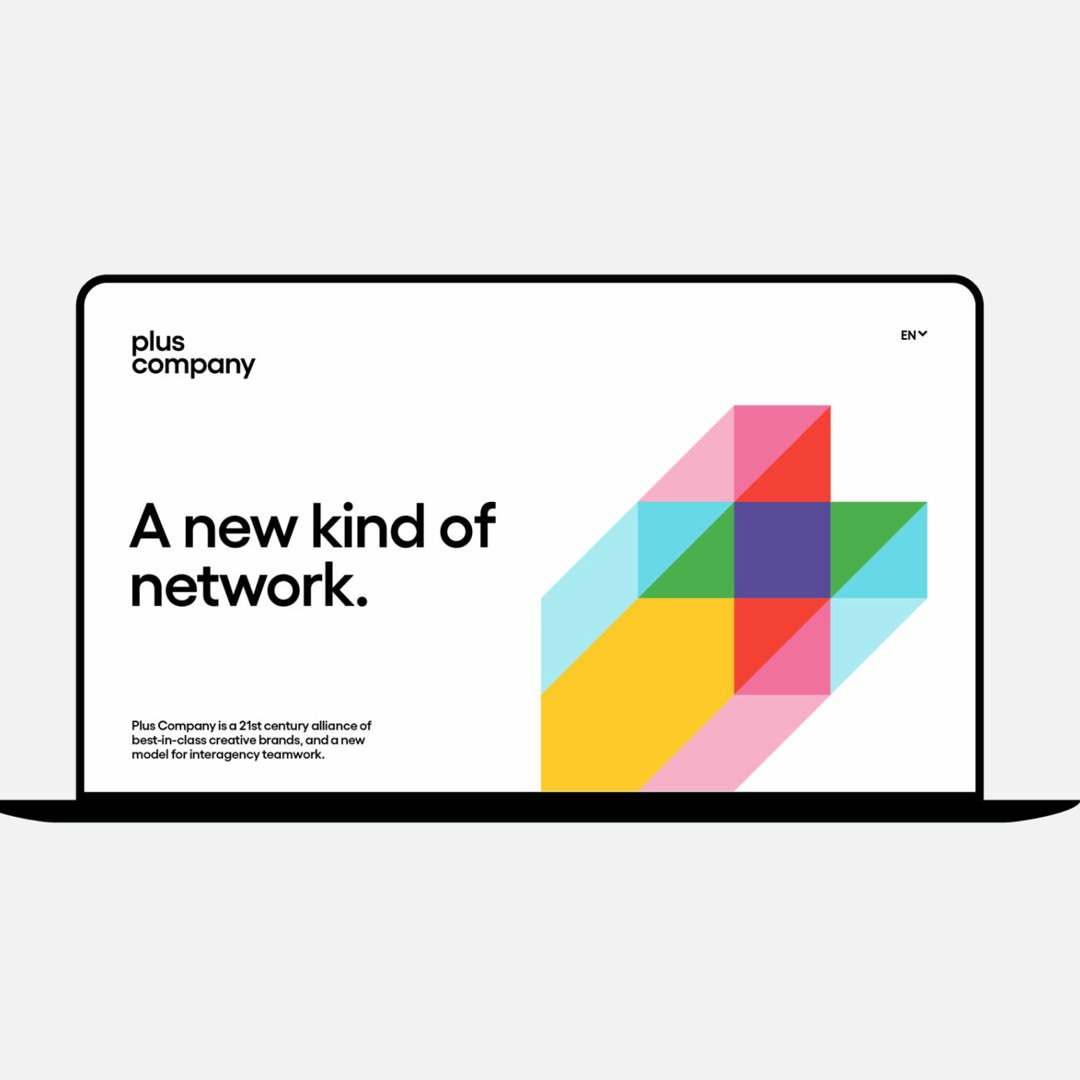
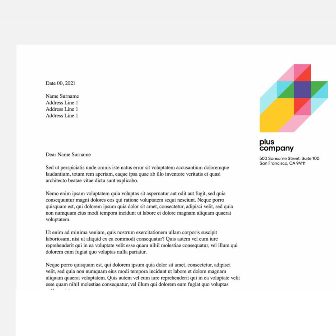
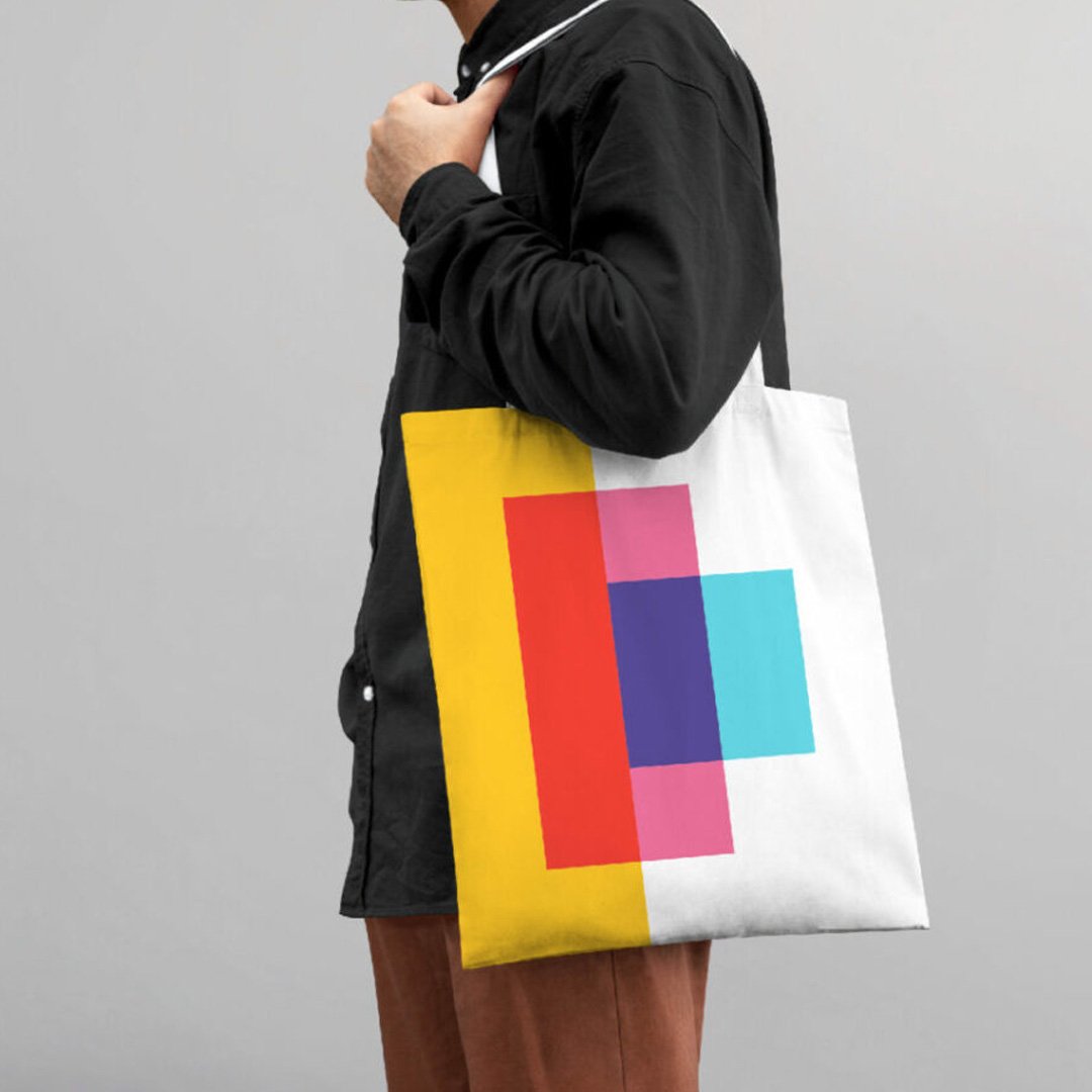
fuseproject also delivered a comprehensive set of design guidelines for the Plus Company team to roll out, including how the system functions across touchpoints such as website design and navigation, UX design, social media, digital, corporate assets, and merchandise.
We partnered with cossette’s digital team to bring the brand identity to life through the Plus Company website. The new website is both appealing and informative, marrying the playful nature of the identity with a simple and functional user experience. Our brand system sets the foundation for a welcoming platform that attracts and engages stakeholders and creative talent alike.