The world of digital marketing is highly complex. The Internet is a vast, seemingly endless landscape for advertisers, who can sometimes get just as lost in the abyss of information as the ads they are attempting to place. However, there are companies like Interactive Media Holdings (IMH), whose offerings enable advertisers to plan, buy, execute, and track digital messaging across a variety of media—in one platform—giving them the unique capacity to highly customize the marketing experience. The team at fuseproject worked with IMH to identify its competitive advantage and core products, develop its brand, and position the company to reflect the full power of this offer.
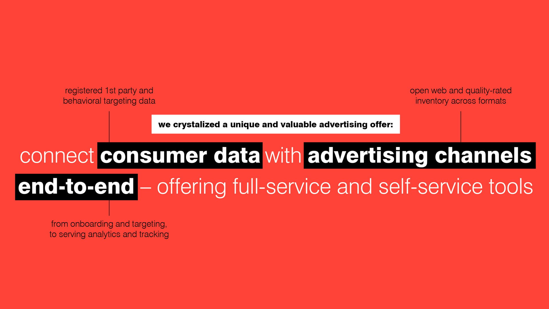
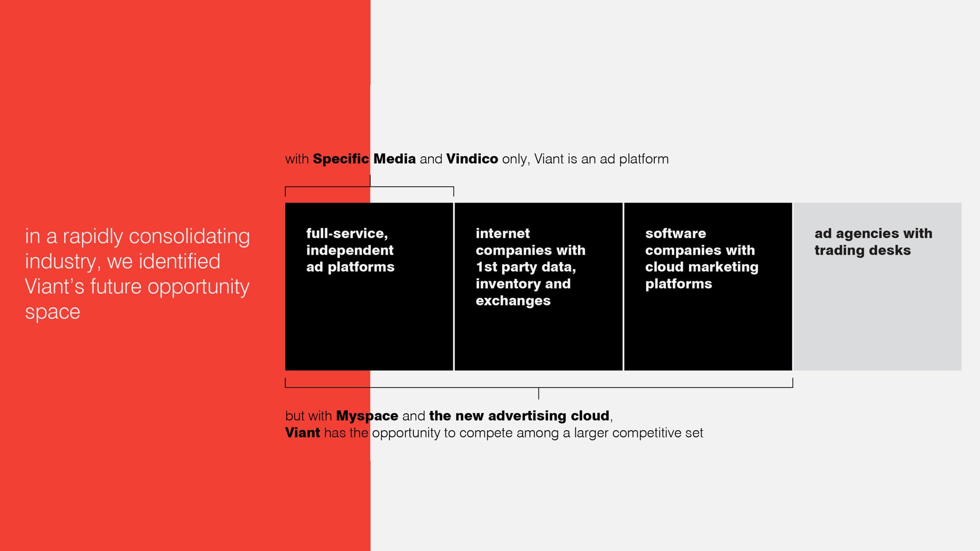
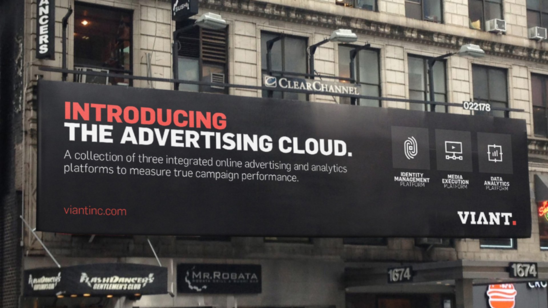
When we audited the current advertising landscape, we found that the industry as a whole separates itself into categories of offerings, and few companies claimed to offer value in multiple categories. By aggregating the companies within IMH, we were able to position the new company as a cross-category, or category-creating business – offering user data, ad placement, and personalized advertising expertise from industry leaders.
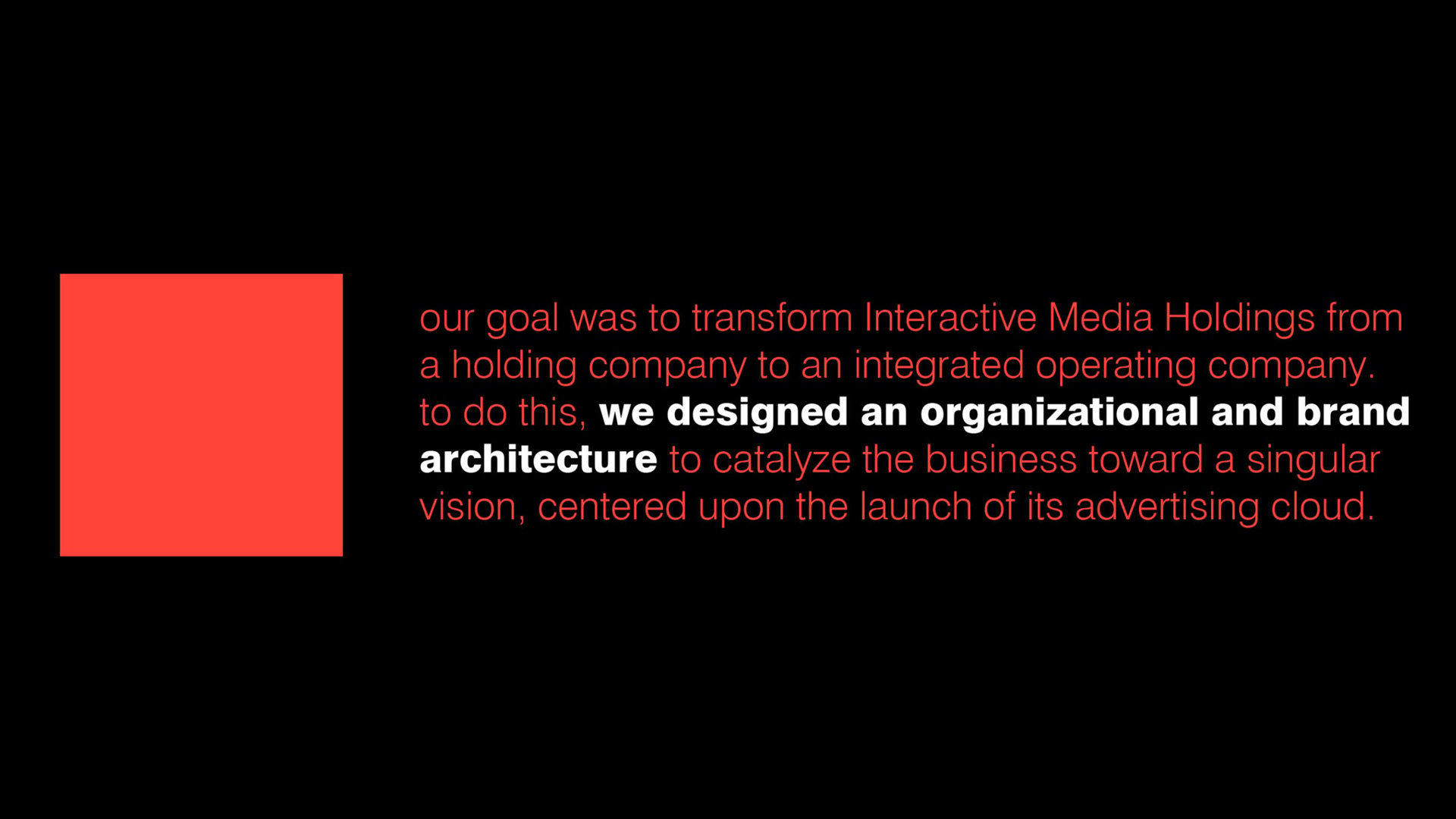
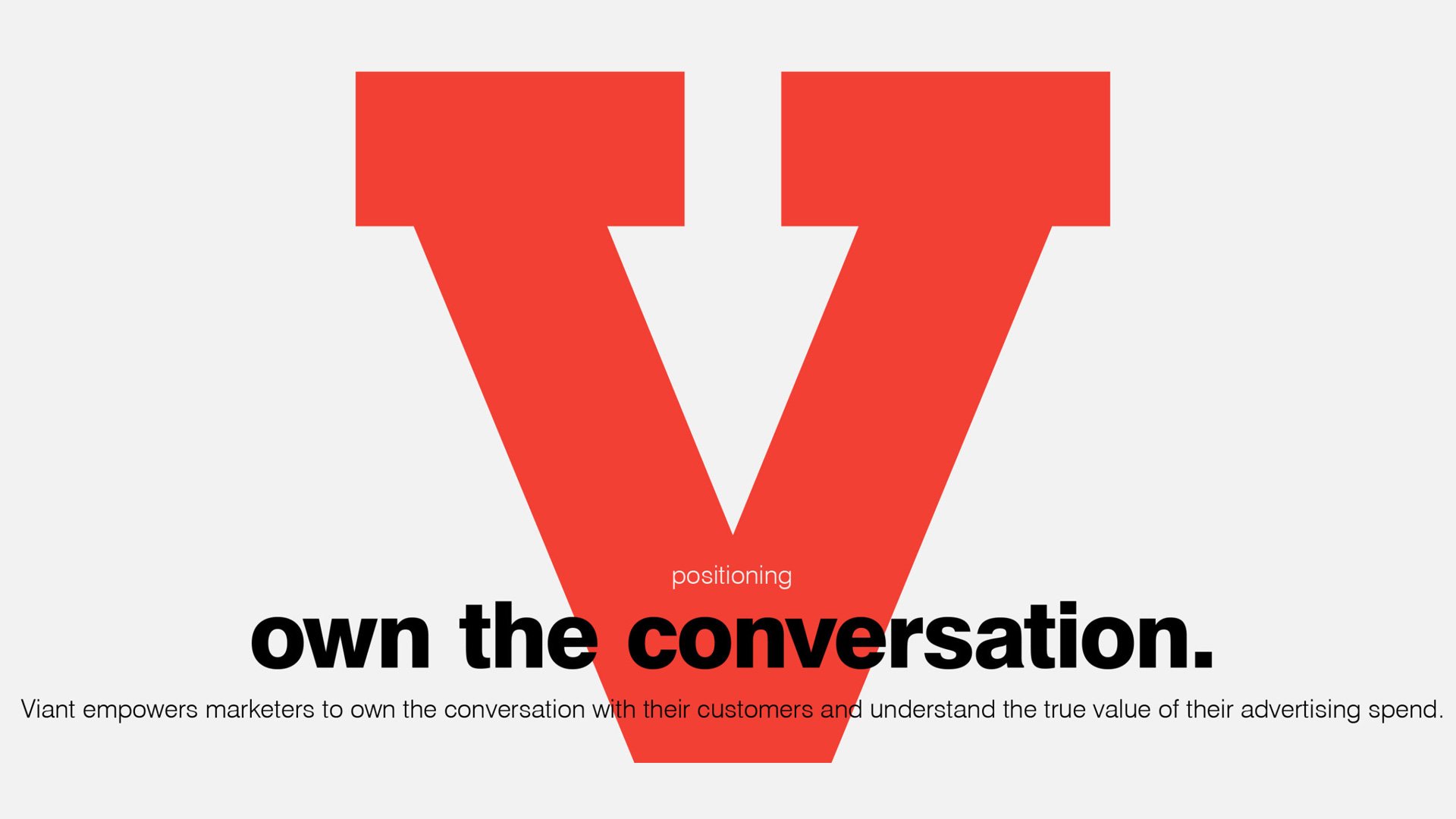
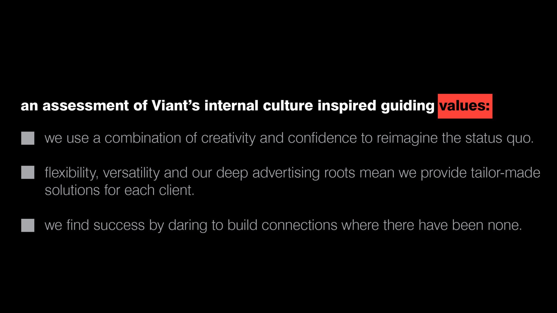
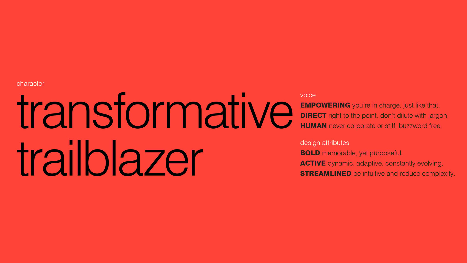
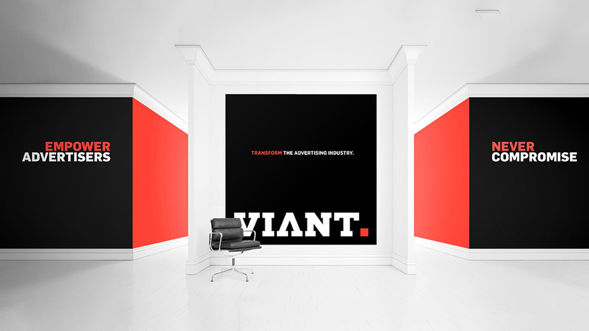
With a new brand architecture focused on the advertising cloud in place, our task was to define a positioning for IMH and guide how the new brand would appear in the world. To competitively position the new company, we focused on the founders’ deep advertising roots as a differentiator, coupled with its extensive data set and targeting capabilities. We developed the positioning “own the conversation” to reflect the ad cloud’s unique ability to empower advertisers to place ads and connect with customers more effectively than ever. The power of the cloud, in partnership with the company’s long-standing entrepreneurial history, led us to develop a bold, active and direct brand character: the transformative trailblazer.
Inspired by the character, IMH’s new name needed to be confident, clear and representative of its trailblazing status in the world of digital advertising, while also reflecting one if its core assets, the founding Vanderhook brothers. We chose Viant – an abstract name that boldly signals strength, calling on words like “giant” and “defiant,” but with a bold ‘V’ to represent the powerhouse Vanderhook leaders.
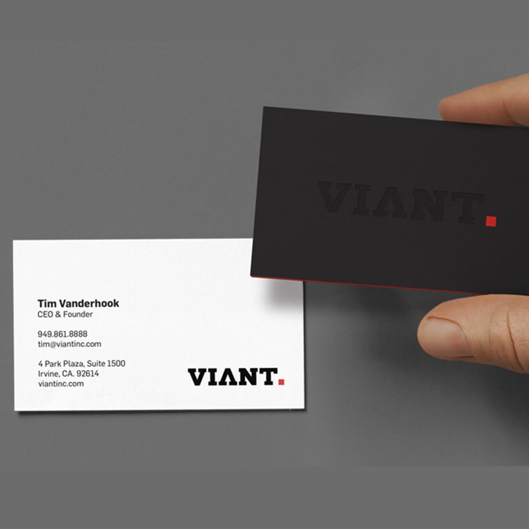
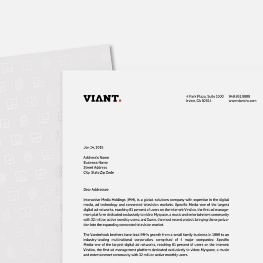
We designed the face of Viant, their new logo, as a clear representation of their company’s characteristics. The logotype is bold with custom drawn slab-serif lettering and sharp corners. Within the negative space of the ‘V’ and mirrored ‘A’ you see a clear arrow pointing down and up respectively, to represent the ongoing dialogue between advertiser and customer made possible by their advertising cloud, and the constant flow of information to and from the cloud. That also led us to the final element of the logo – a period at the end of the name. VIANT. Period. The period perfectly solidifies and embodies the attributions of the company. They are a bold and confident brand. They get to the point. They help marketers own the conversation with their customers.
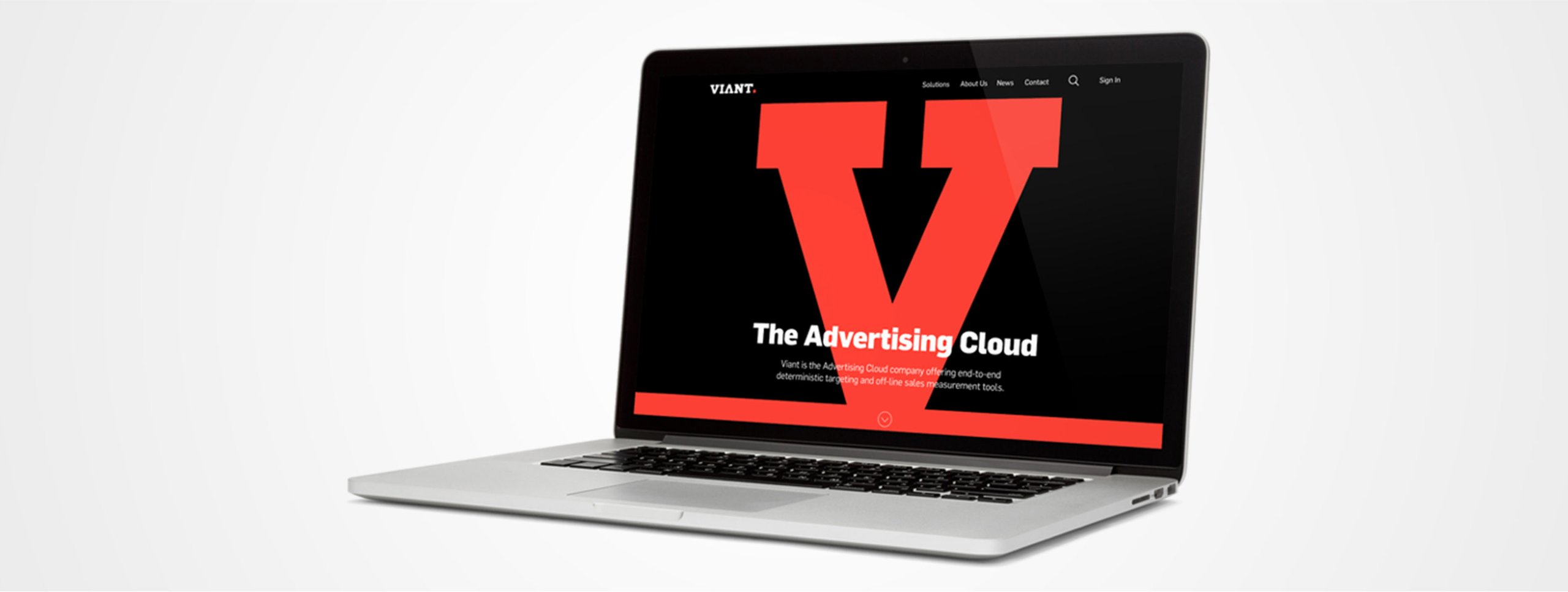
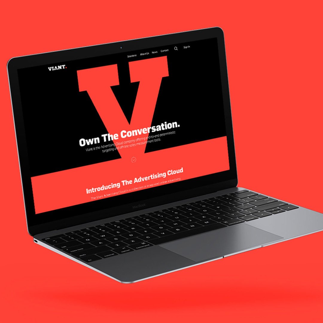
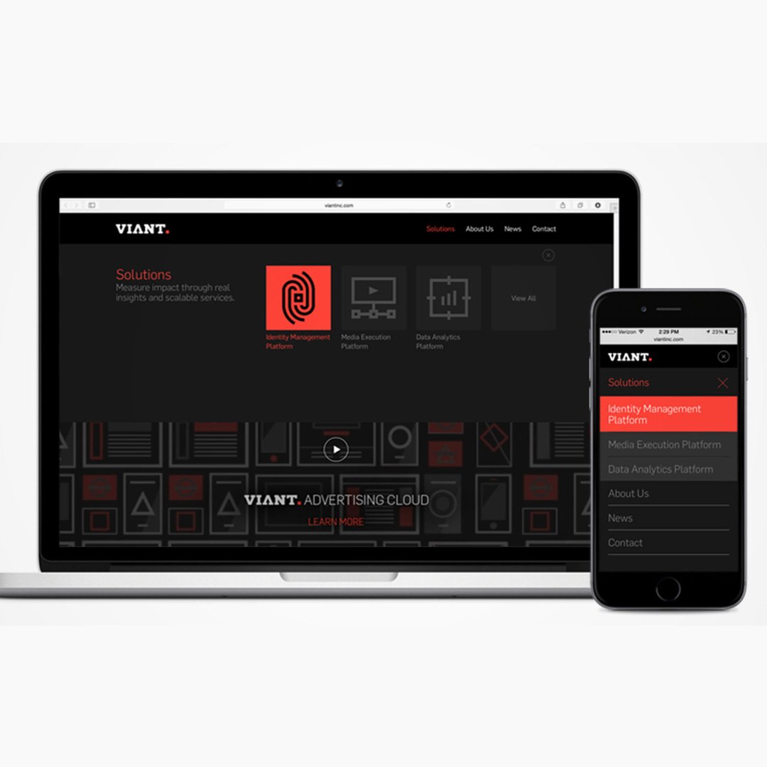
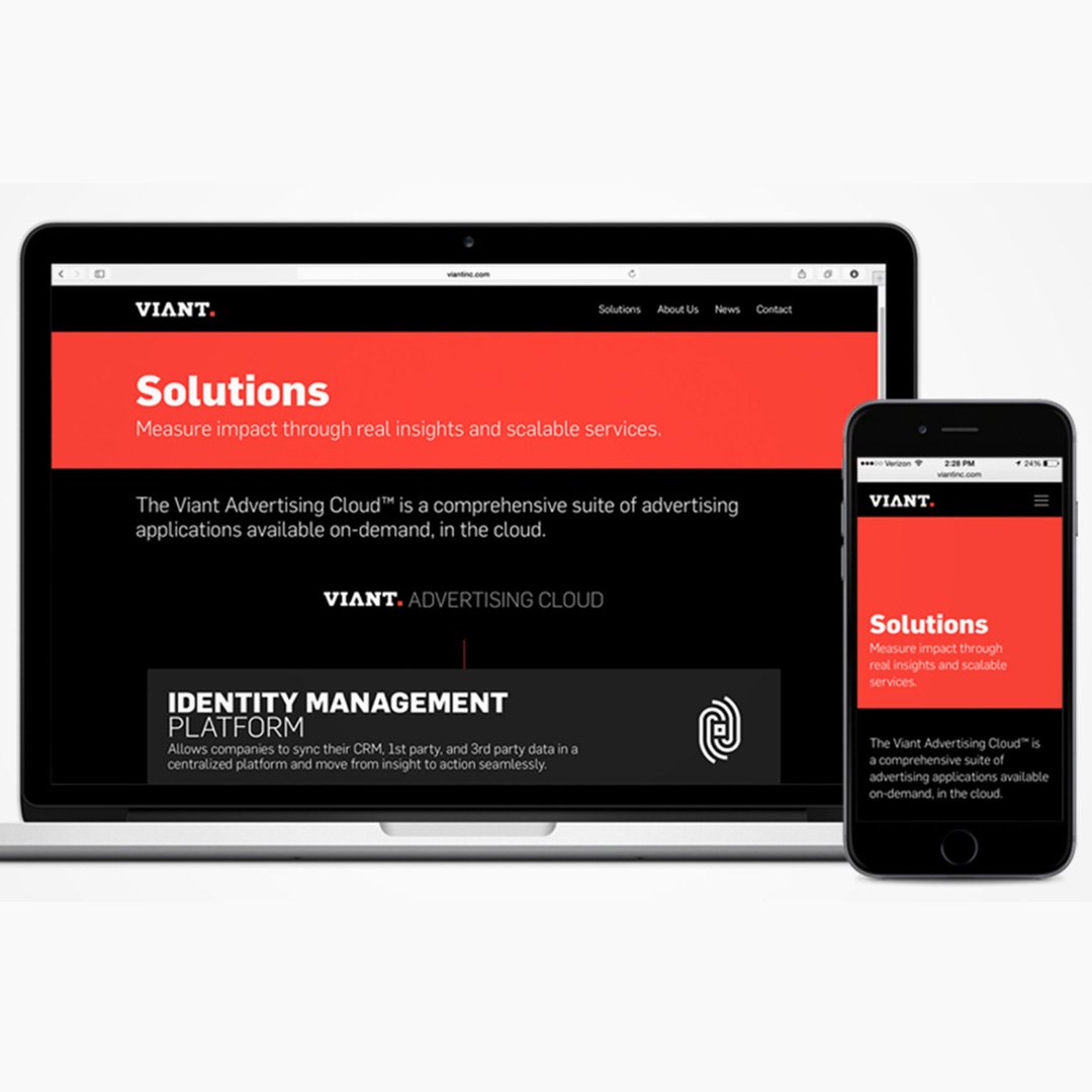
Bold, streamlined and responsive describes our approach to the Viant website. To introduce the new brand to the world, a large V dominates the homepage. Oversized drop down menus and bold, yet simple, iconography help users navigate the website to discover the key platforms that make up the new advertising cloud with ease. Designed for lead capture, form fields are prioritized to be easily accessible.