Mobile payment is changing commerce and creating new and easy social interactions around commerce. When PayPal approached fuseproject with an idea to facilitate real world payments, the prospect of creating a physical product and new brand for the e-commerce pioneer was a tantalizing design challenge.
While the PayPal brand is recognized worldwide, for many it remains solely associated with online shopping, particularly shopping on eBay. To expand its relevance, PayPal approached fuseproject to help them craft a strategic approach and compelling experience for small businesses in the offline world.
Based on insights gained from talking to internal stakeholders, small business owners, and tech-savvy consumers, we learned perceived strengths and weaknesses. A thorough analysis of the competitive landscape helped us codify a recommended value proposition, positioning and experience principles for our new platform.
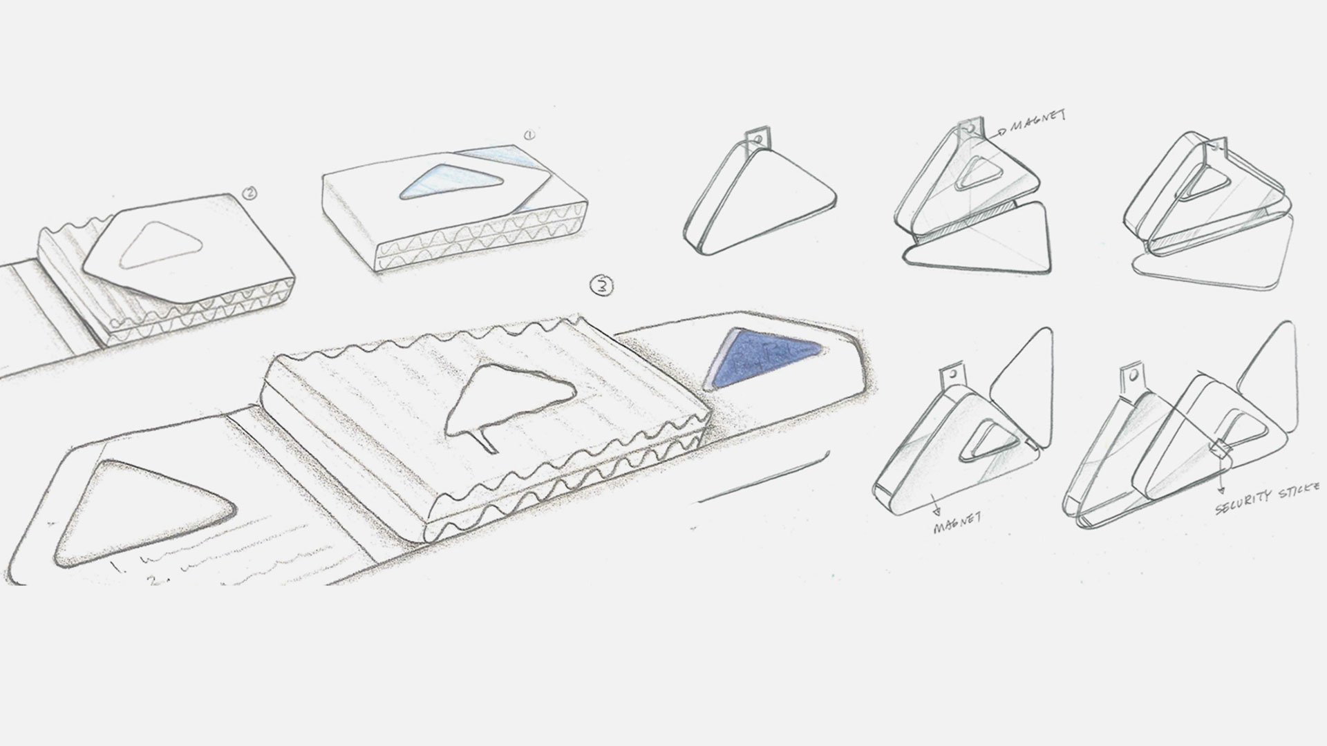
Based on this strategic foundation fuseproject crafted every aspect of the PayPal Here experience: the name, identity, device, packaging, communications, and PR efforts. PayPal Here has been quickly adopted by thousands of small business owners, and has established a strong beachhead for the brand in the physical world that will continue to grow over time.
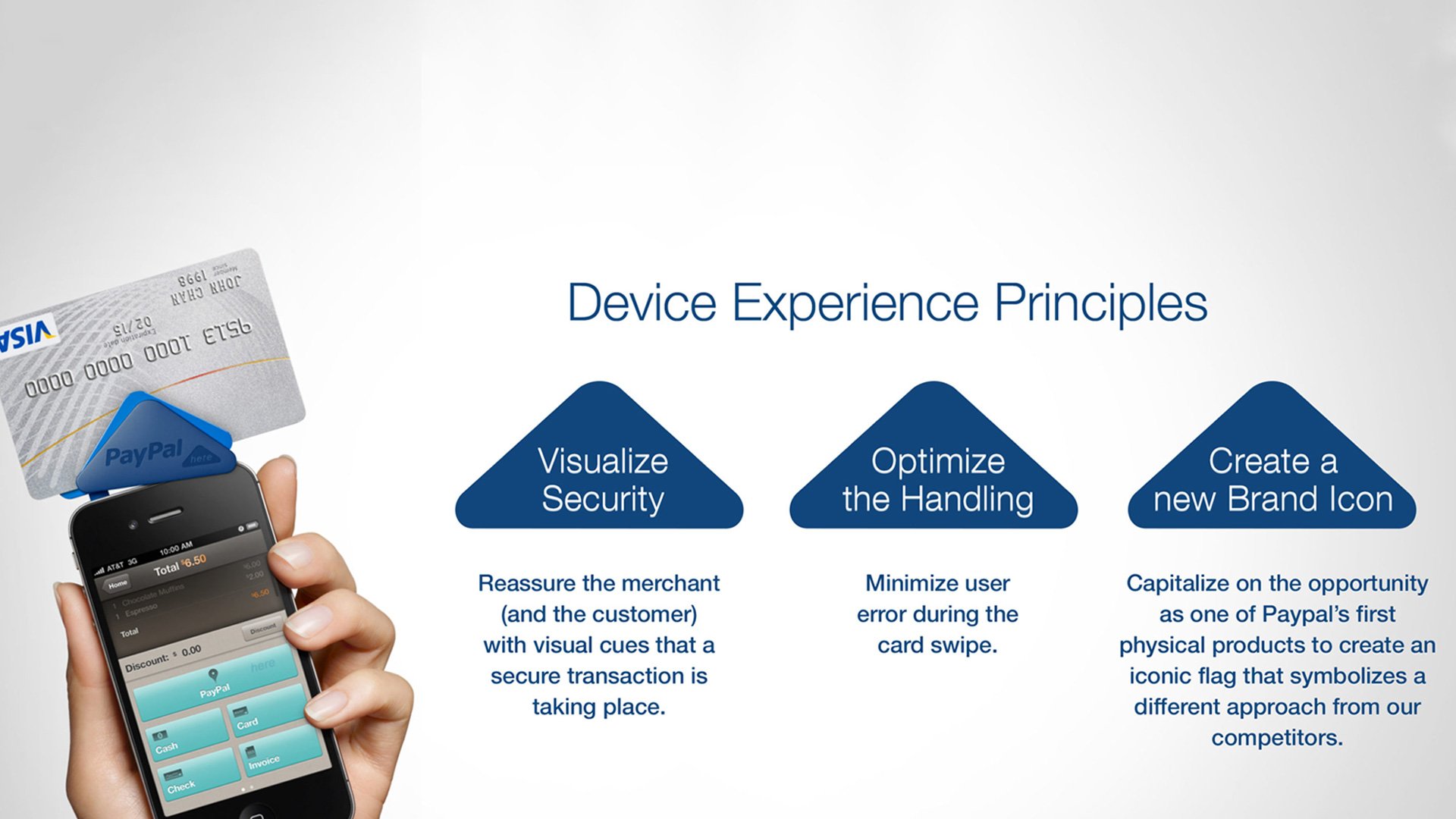
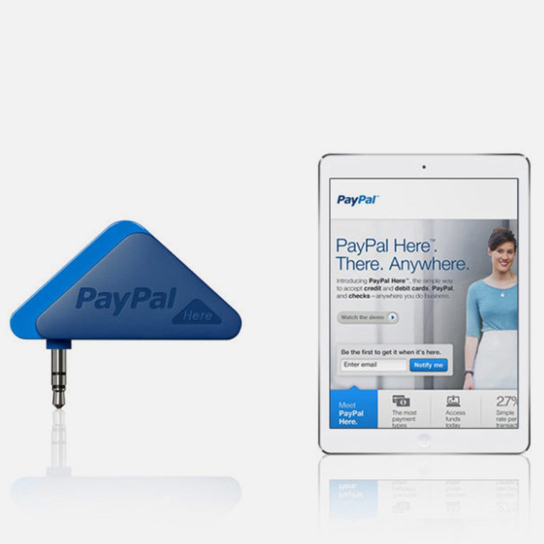
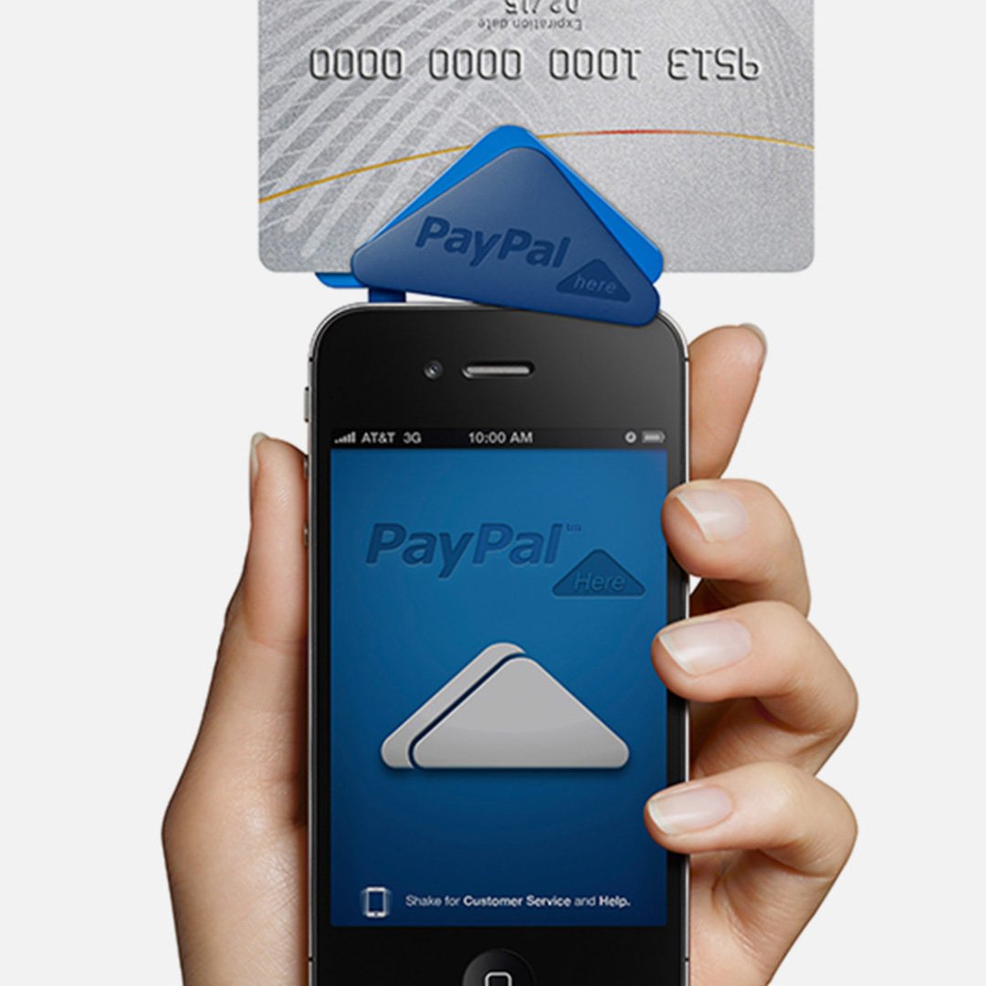
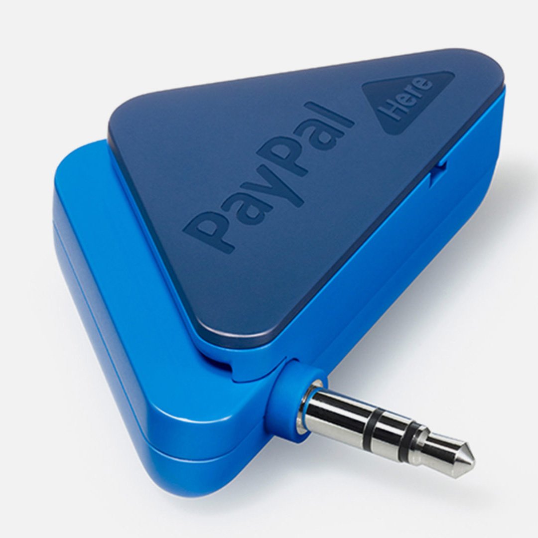
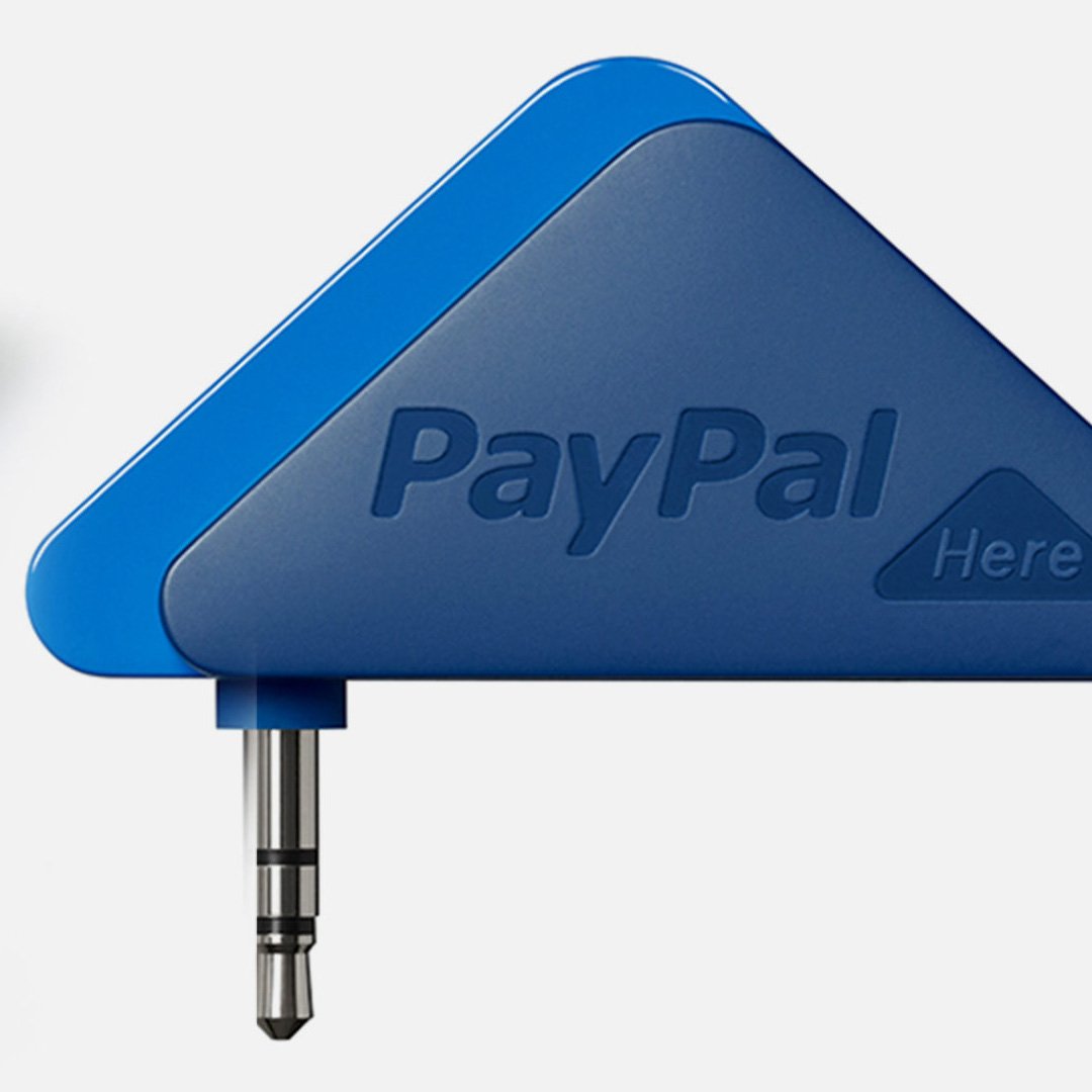
PayPal and fuseproject’s brand and design team partnered on the expression of this new experience through all interaction points, from naming to packaging, sound and device, web and communication. The Here logo, iconography, packaging and device follow an arrow-like form that references the physical world where payments happen one-on-one, and also the virtual cloud world that enables these new forms of payments. The arrow is an ancient symbol that shows something being done in the here and now, and became the inspiration for the shape of the of the product, logo, web, graphics, naming and application sound design. In the PayPal Here experience the arrow also represents easy payment. It expresses how each swipe sends your transaction onward to the cloud.