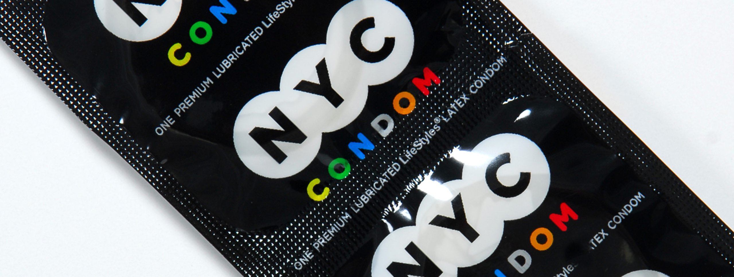
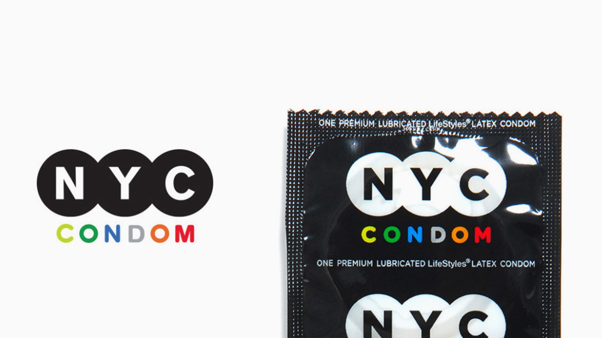
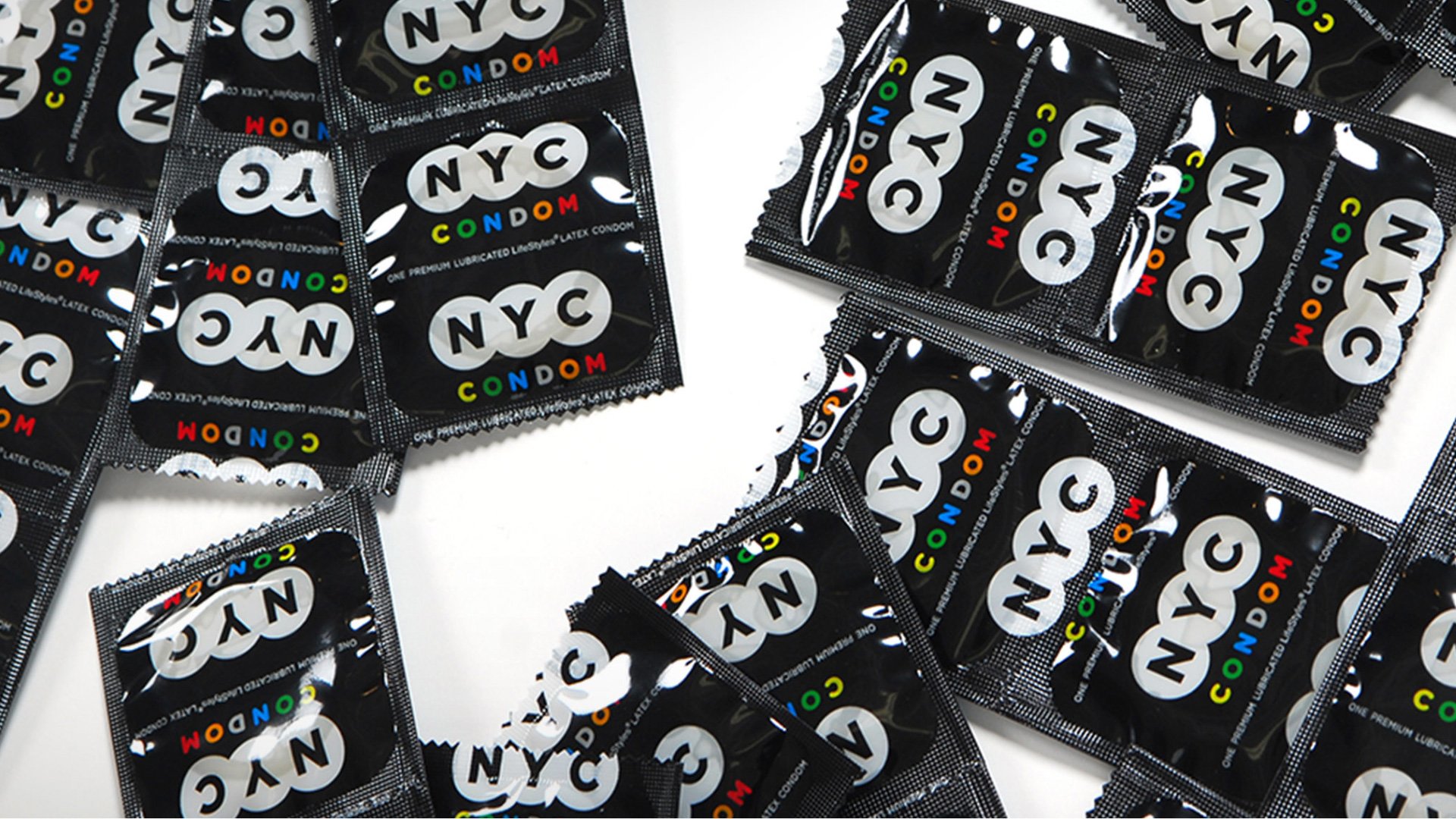
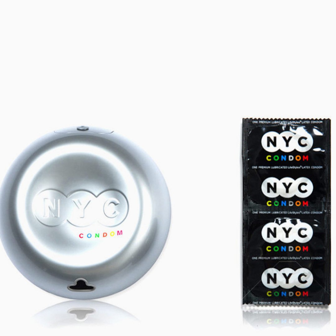
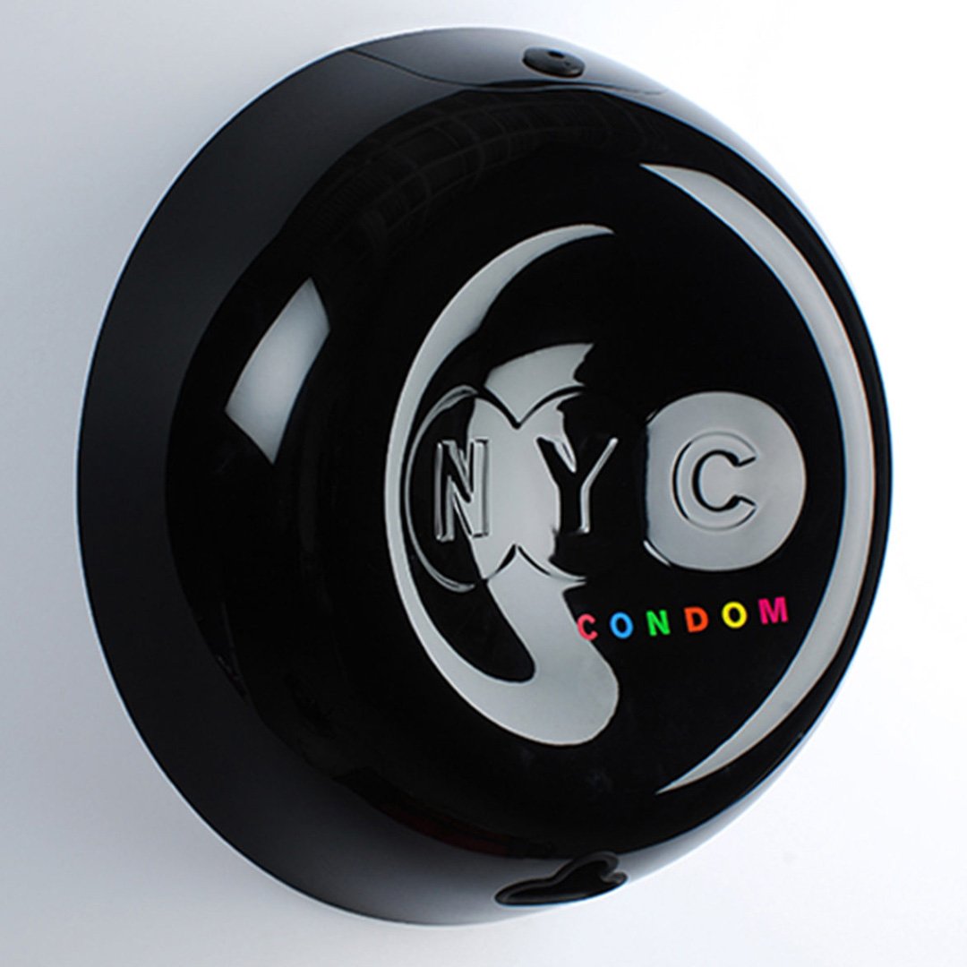
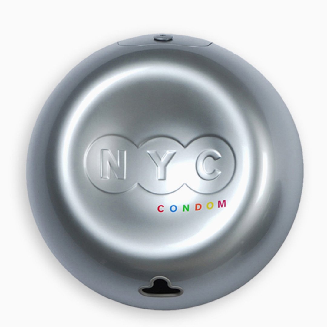
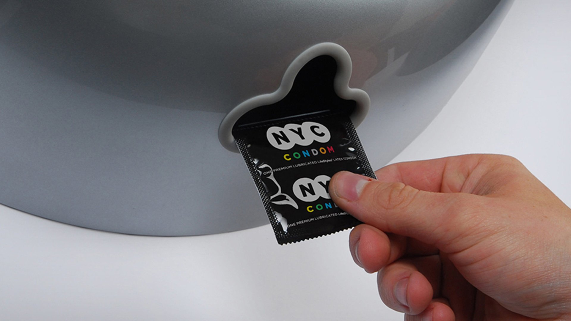
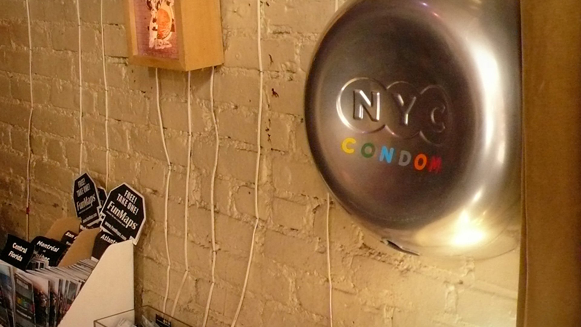
NYC Condom
The NYC Condom logo is reminiscent of distinct New York icons, shapes and typefaces. This familiarity makes an entire ecosystem of the NYC Condom brand instantly identifiable to the citizens of NY. Ironically, the big idea was to blend in to the urban landscape, but stick out as a resource beacon, with colors and design details that become apparent only when you approach the dispenser. This approach drives adoption in a variety of venues that might normally be opposed to installing a condom dispenser.
Combine and expressive identity that is immediately recognizable, with a slightly taboo subject matter, and you’ve got a great communications platform. Our strategy was to let the logo do the talking, and ignore the obvious overtures that could degrade the brand. This lead to a very approachable product, that far exceeding expectations by tripling the original goal to over 39 million condoms distributed in the first year of the program!
- Brand
- Product
- Recognition
News
Awards
- NYC Condom, 2009
- GOOD Design Award
- NYC Condom, 2009
- iF Award
- Spark! - NYC Condom, 2008
- Spark Awards
- NYC Condom, 2008
- “Equipment”
- NYC Condom, Silver Award, 2008
- IDSA - Business Week
EXHIBITS
- 100 Years of Swiss Design
- November 2017
- Museo de Arte Moderno