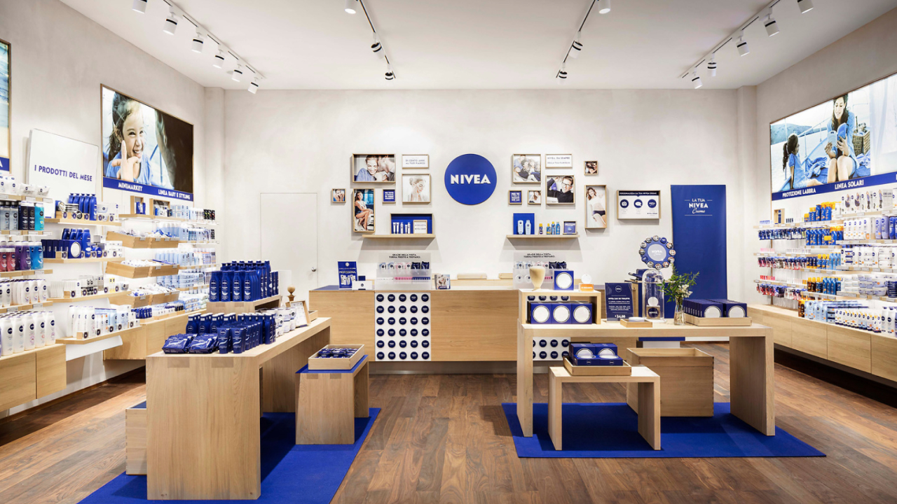
A modernized identity system redefines the world’s most versatile cosmetic brand for the next phase of growth.
Our collaboration with Nivea presented an extraordinary challenge: modernize a global leader while maintaining its iconic recognition. As a high-traffic supermarket brand, Nivea’s redesign had to pass rigorous testing—shoppers needed to recognize it as Nivea in less than two-tenths of a second. The ambitious goal was to complete this transformation across over 400 SKUs in time for the company’s 100th anniversary.
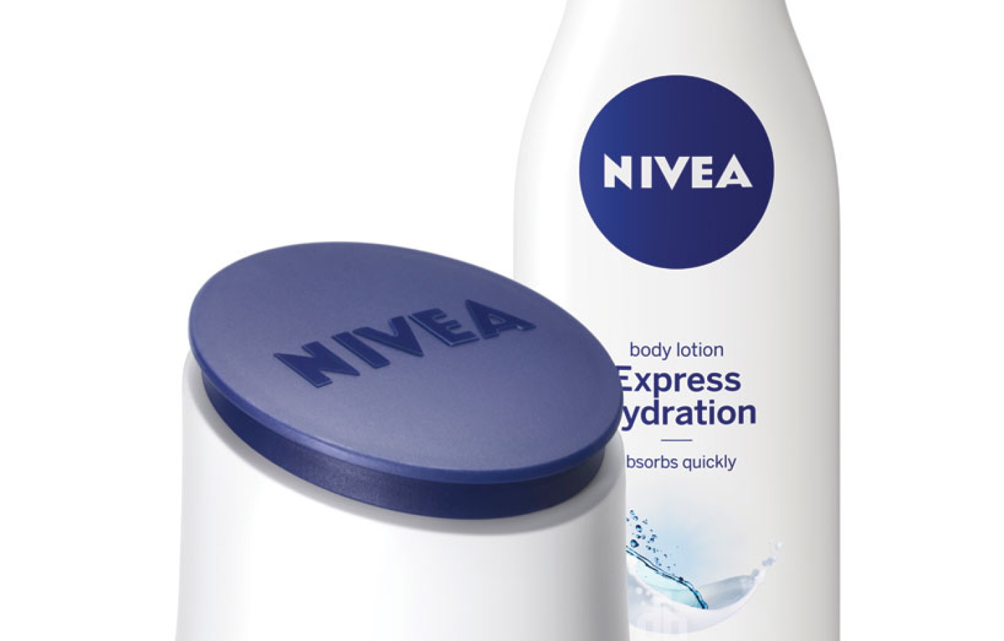
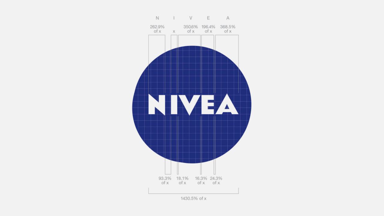
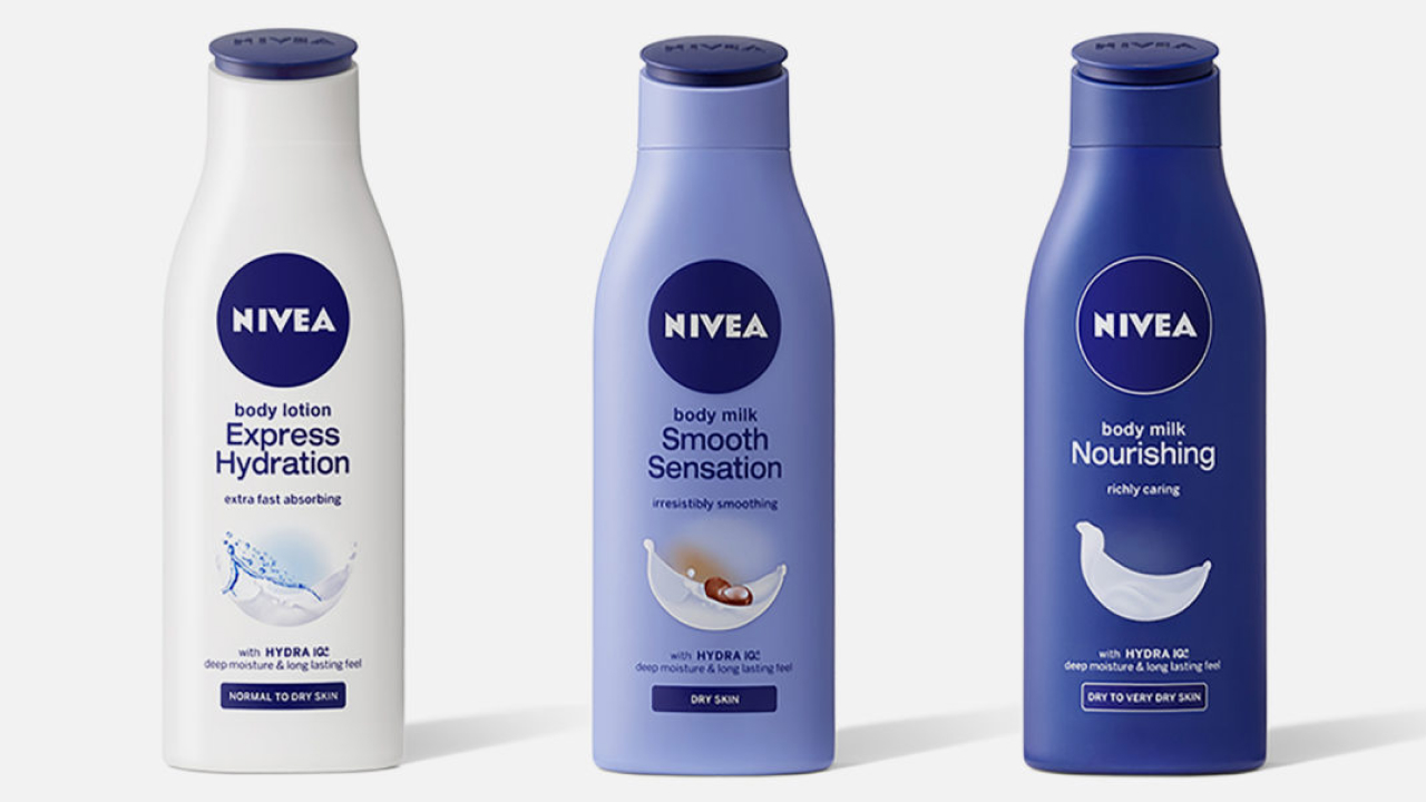
The redesign introduced a bold evolution of Nivea’s identity, centered on a circular blue element paired with refreshed typography and colors. The result was a brand that remained unmistakably Nivea while projecting a more premium, unified aesthetic. Previously inconsistent designs across product categories—such as body care, face care, men’s grooming, and deodorants—were harmonized into a cohesive visual system, eliminating confusion and enhancing shelf appeal.
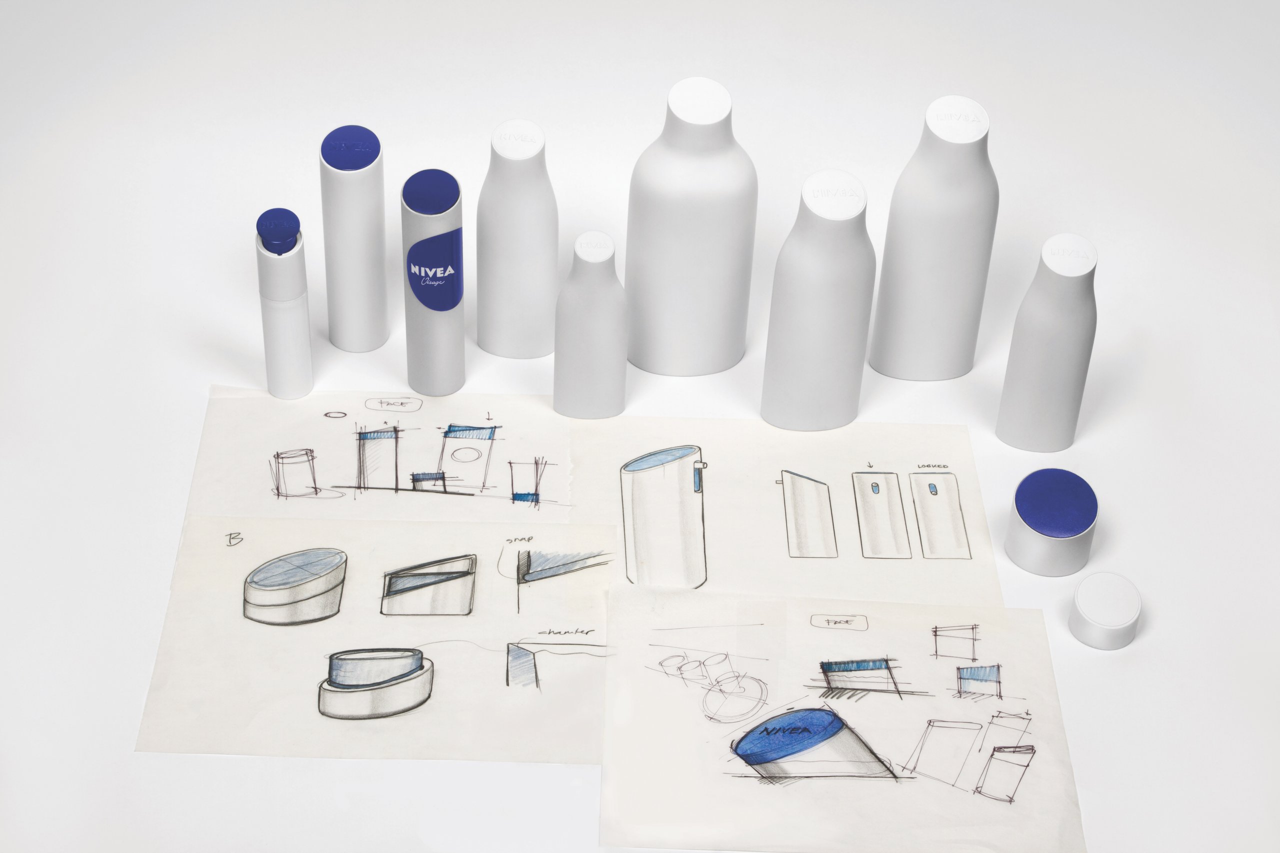
Sustainability was a key focus. We reduced plastic use in packaging by 20-25% and labeling by 30%, aligning with Nivea’s environmental goals. Despite these changes, the redesign was completed in just 14 to 18 months, blending design innovation with operational efficiency.
Unveiled during Nivea’s 100th-anniversary celebrations, the rebrand exceeded expectations. The final design proved to be instantly recognizable, resonating with both loyal and new consumers. By honoring its heritage while embracing modernity and sustainability, Nivea’s refreshed identity sets the stage for its next century, demonstrating the transformative power of design.
Services
66%
Approximately 66% of purchase decisions for personal care products, including skincare and body care, are made directly in front of the shelf, highlighting the critical role of packaging and branding in influencing consumer choices.
15% Less
Fuseproject’s redesign of NIVEA’s packaging resulted in a 15% reduction in overall materials used, including a 23% decrease in labeling materials, contributing to the brand’s sustainability goals while maintaining its iconic look.
Over 500
More than 500 NIVEA SKUs worldwide now feature the logo and visual identity redesigned by Fuseproject, ensuring a cohesive and modernized brand presence across global markets.
“The new design consistently translates the successful Nivea brand values into a product that consumers can see and feel, thereby making products in all categories immediately recognisable.”